VibeSync is a user-friendly, community-focused platform that makes it easy to discover, share, and attend local events in Southeast Wisconsin—whether you’re a visitor or a native, with or without social media.
Role
UX Researcher & Designer
Platform
Mobile
Tools
Figma, Adobe Creative Suite, Google Suite
Year
2025
Overview
I noticed a gap in how users, especially non-social media users, discover and attend local events. VibeSync was conceptualized as a mobile-first solution focused on creating an easy, enjoyable, and trustworthy experience to search for, discover, and attend events.
The Problem
How do people find local events—and how can we make it easier, especially without relying on social media?
Process: Double Diamond Framework
Discover → Define → Develop → Deliver
The project was guided by a user-centered research plan, using the Double Diamond framework. Early planning focused on understanding real user frustrations, establishing goals to design for these needs, and setting methods to validate the solution through iterative testing.
Discover: User interviews + competitor analysis
Define: Pain points, goals, and personas
Develop: Wireframes + flows + prototypes
Deliver: Usability testing and revisions
Affinity Mapping
I synthesized interview insights into thematic pain points: time lost searching, information gaps, and low trust. This helped prioritize features like filtering events by specifics (based on user preferences) and giving the option of whether or not to connect via social media.
The project was guided by a user-centered research plan, using the Double Diamond framework. Early planning focused on understanding real user frustrations, establishing goals to design for these needs, and setting methods to validate the solution through iterative testing.
Discover: User interviews + competitor analysis
Define: Pain points, goals, and personas
Develop: Wireframes + flows + prototypes
Deliver: Usability testing and revisions
Personas
Erica (31): Wants low-stress, family and solo-friendly event options.
Charles (40): Social media isn't helpful for finding tailored events. Wants quick, reliable experiences.
Building personas like Erica and Charles clarified that our users weren't just "event seekers" — they had different needs, emotional triggers (like social anxiety or fear of missing out), and practical needs. Designing for their behaviors directly influenced VibeSync’s core features like preference quizzes and non-social login.
Research
Goals
I aimed to deeply understand users’ pain points, their preferred ways to find and attend events, and their comfort levels with current technologies. These insights shaped every design decision, ensuring that solutions were grounded in actual needs rather than assumptions.
Identify top pain points and needs
Understand event discovery behavior
Learn how users want to attend events
(virtual vs in-person)
Primary Research
User interviews highlighted real-world frustrations, including time-consuming event discovery, lack of reliable logistics info, and the risks of unclear payment systems. These findings gave us direct user quotes and situations to design around, narrowing our focus on simplifying search and improving booking trust.
7 interviews, age 30–55, Milwaukee/Chicago based
Pain Points:
Events hard to find without social media
Need more filters (family-friendly, solo, parking)
Ticketing issues (security & trust)
Secondary Research
We conducted a competitor analysis to identify gaps left by major platforms like Eventbrite, Meetup, Facebook, and Google. Key insights revealed that lack of event details, overpromotion of paid listings, and unclear ticketing systems left users frustrated—leading us to prioritize transparency and ease-of-use.
Competitors: Eventbrite, Meetup,
Facebook, Google
Gaps: Lack of filters, limited event info,
too much sponsored content
POV and HMW Insights
Defining POVs allowed us to stay user-focused, articulating the emotional and functional needs behind every problem identified. These became a north star during ideation sessions, ensuring each solution mapped back to real user challenges.
Top POVs (Points of View):
Save users time finding events
Help non-social media users discover what's out there
Make it easy to book, share, and filter
Using 'How Might We' questions kept brainstorming solutions broad but focused. These prompts encouraged design ideas like a friend feature (future roadmap), smart search filtering, and seamless onboarding without forcing social media accounts.
Key HMWs (How Might We):
Help users find events without social media
Let them filter by interest
Offer a social but optional friend-sharing feature
Task Flows
Create an Account
Homepage → Email & Password → Quiz → My Account
Book an Event
Search → Login → Book Now → Payment Info → Confirmation Page
Task flows for key actions — creating an account and booking an event — were mapped early. This helped uncover friction points before visual design began and ensured users could achieve their goals with minimal steps.
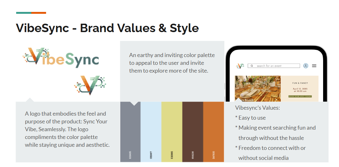
Brand Values and The Why
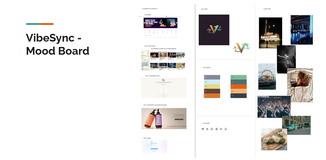
VibeSync’s brand was intentionally created to feel friendly, earthy, and inviting, reflecting its community-centered mission. Decisions about the color palette, logo, and voice were made to break from sterile event-finding platforms and create emotional connection.
Designed in Figma and refined with the help of AI
Mood Board
Brand Values
VibeSync Style Tile
Wireframes: Create an account
Account creation with onboarding quiz
Each level of wireframing—low, mid, and high-fidelity—allowed rapid iteration while constantly testing assumptions. Early lo-fi sketches focused on user flows, while mid-fi mockups refined navigation logic. Hi-fi prototypes added visual branding and prepared for realistic testing scenarios.
Designed in Figma and refined through usability testing
Lo-fi
Mid-fi
Hi-fi
Wireframes: Book an Event
Search + book with transparency and ease
Designed in Figma and refined through usability testing
Lo-fi
Mid-fi
Hi-fi

Test the Prototypes
Prototype Testing
Usability testing with five users confirmed ease of use but surfaced minor friction points, particularly in the booking process. Based on feedback, a confirmation step was added post-login, and event cost was made clearer during checkout — showing responsiveness to user feedback.
Users: 5 testers walked through account creation and booking
Findings:
✔ Intuitive navigation
✔ Clear event discovery
➕ Added event info page after login
➕ Cost clarity added to payment screen
Final Thoughts
VibeSync has the potential to successfully bridge a gap in event discovery. It’s social-optional, preference-based, and user-friendly making it the best of all worlds. Future iterations will improve onboarding logic and expand reach.
VibeSync successfully validates its hypothesis: a social-media-optional, user-friendly platform can simplify event discovery. However, continuous iteration on booking clarity and expanding accessibility for different user demographics will be crucial in the next phases.


