

Case Study: Add A Feature

Wanderlog is a collaborative travel planning app that helps users organize trips with friends and family. Its tools for building itineraries are robust, but the app lacked lightweight ways for travelers to manage overbooked days or reflect on how their trip was going.
Role
UX Researcher & Designer (Designlab Academy)
Platform
iOS
Tools
Figma, Adobe Creative Suite, Google Workspace
Year
2025- 75 hours
Hypothesis
This project began with a simple observation: planning trips in Wanderlog often leans heavily on logistics—flights, hotels, and jam-packed itineraries—yet the human side of travel often gets lost. In interviews and personal use, I noticed two recurring frictions: days that became unintentionally overbooked, and the lack of space to capture how those days actually felt.
My hypothesis was that expanding Wanderlog’s toolkit with small, empathetic features could address both gaps. If users had a lightweight way to rebalance an overbooked day and check in with their mood, Wanderlog could evolve from being just a scheduling tool into a travel companion. By keeping the flows simple and tightly integrated, I believed these features would reduce stress, foster reflection, and encourage ongoing engagement with the app throughout a trip.

Industry Overview and Investment
The travel industry is one of the largest global markets, valued at over $9 trillion, with digital trip planning tools becoming increasingly central to how people prepare for and experience travel. Apps like Wanderlog, TripIt, and Roadtrippers simplify logistics, but travelers are also seeking more personalized and supportive features that help them manage stress and avoid overscheduling.
Why Wanderlog?
Wanderlog already stands out as a collaborative, easy-to-use trip planner, but our initial research through user interviews revealed two gaps in the experience:
Overscheduling: Travelers often overfill their itineraries and feel stressed when their days become unrealistic. While Wanderlog helps plan logistics, it didn’t provide tools to rebalance an overbooked day.
Reflection: Users wanted a way to check in with how their trip felt — not just track what they did. Without a lightweight mood or experience log, the emotional side of travel was missing.

Process: Double Diamond Framework
Discover → Define → Develop → Deliver
To frame the process, I used the Double Diamond model—moving from discovery to definition, and from development to delivery. While full delivery wasn’t complete at the time, we successfully worked through the first three phases.
Discover: User interviews + competitor analysis
Define: Pain points, goals, and persona
Develop: Wireframes + flows + prototypes
Deliver: Usability testing and revisions
Goals & User Interviews
"I always end up cramming too much into one day when I travel."
In a user interview, one participant described how their Wanderlog itinerary often became unrealistic. While Wanderlog makes it easy to plan trips, users felt there wasn’t enough support once days were overbooked or when they wanted to reflect on how their trip felt. This became a recurring insight — Wanderlog’s planning strengths weren’t fully balanced with tools for managing and reflecting on the travel experience.
Goals
This feature design project aimed to create lightweight, empathetic additions that:
Help users identify and resolve overbooked days in their itinerary.
Introduce a daily mood check-in so travelers can reflect on their experience, not just their logistics.
Reinforce Wanderlog’s approachable, collaborative style without adding complexity.
Build trust and routine by giving users clear confirmations and control.
My design goal was to extend Wanderlog’s value beyond planning tasks — helping travelers stay balanced, supported, and confident while on the go.
User Interviews
To begin my research, I conducted interviews with frequent travelers who had used planning apps like Wanderlog, TripIt, and Google Maps. I asked users about how often (if ever) they found themselves overscheduled, did they ever feel stressed during travel, did and do they journal during travel I focused on how they planned, what frustrated them, and what was missing.
Key findings included:
5 out of 5 participants admitted to overscheduling at least one day of their trips.
Several described feeling stressed or guilty when they couldn’t fit everything in.
Most said they used manual notes or outside apps to track how their days “felt,” since no planning tool offered that reflection.
Participants emphasized that language matters: terms like “Overbooked” or “Take a break” felt natural and motivating.
These insights confirmed that the gap wasn’t in Wanderlog’s planning tools — it was in providing empathy and balance once a trip was underway.

Competitor Analysis: Findings and Opportunities
Now that I had some insights from user interviews, I wanted to compare Wanderlog to other services and apps available to consumers. While Trippit, Rotadtrippers and Tripsy all help users plan and organize trips, none of them take user emotion or itinerary preferences into account. Wellness apps are great for tracking mood and health, but aren’t directly travel related.
Wanderlog has the chance to stand out by weaving empathy and balance into the travel planning process. While TripIt focuses narrowly on logistics, Roadtrippers can overwhelm with options, and Tripsy keeps itineraries static, Wanderlog can position itself as collaborative, supportive, and adaptive — giving travelers tools to both plan with confidence and feel more at ease during their journeys.
Competitor Overview
TripIt
TripIt positions itself as an “all-in-one travel organizer,” best known for auto-importing flights and hotels for business travelers and frequent flyers. Its strength lies in logistics, with premium alerts and seat tracking, but it feels utilitarian and doesn’t address pacing or well-being. This creates an opening for Wanderlog to differentiate by layering in wellness and pacing insights.
Roadtrippers
Roadtrippers brands itself as the go-to for planning U.S. road trips with scenic stops and attractions. It excels in discovery and route optimization, but the experience can overwhelm users and is limited geographically. Because it lacks energy or fatigue management, Wanderlog can offer a more balanced approach that blends discovery with wellness.
Tripsy
Tripsy calls itself a “central travel companion” for organizing itineraries, especially for leisure travelers and families. Its elegant UI and sharing features are strong, but itineraries remain static with no adaptive recommendations. Here Wanderlog can stand out by using wellness-driven adjustments to make trips feel more human-centered and proactive.
Wellness Apps (Indirect)
Apps like Apple Health, Fitbit, or Calm dominate the wellness space with credible tracking and widespread adoption. However, they are siloed from travel planning and don’t connect wellness insights to itineraries. This validates user appetite for energy and mood tracking — and highlights a gap Wanderlog can fill by bridging wellness data with trip pacing.
Key Findings
Competing travel apps focus heavily on logistics or discovery but leave gaps in pacing, wellness, and emotional support.
TripIt provides strong automation for flights and hotels but feels utilitarian, overlooking pacing and traveler well-being.
Roadtrippers offers rich discovery tools but overwhelms with too many stops and no way to balance fatigue on long days.
Tripsy delivers an elegant UI and sharing options, but itineraries are static with no adaptive recommendations.
Wellness apps (Apple Health, Fitbit, Calm) show clear demand for energy and mood tracking, but they operate separately from trip planning.
Opportunities for Wanderlog
Wanderlog can stand out by blending strong itinerary planning with empathetic features that support both logistics and traveler well-being.
Differentiate with Overbooked Day Adjustments to help users rebalance crowded days.
Introduce Daily Mood Check-ins to add reflection and emotional connection to the trip experience.
Provide recap and undo features that reinforce clarity, trust, and user control.
Highlight Wanderlog’s collaborative and approachable brand as an alternative to purely utilitarian or overwhelming competitors.
Position Wanderlog as the first empathetic travel planner — bridging the gap between where travelers go and how they feel along the way.
Affinity Mapping
After mapping the competitive landscape through SWOT analysis, the next step was grounding opportunities in real user voices. I needed to organize the insights from user interviews into categories to highlight the common patterns regarding their travel mood and booking habits.
Throughout the mapping, these were the themes that presented themselves:
Clarity vs. Overload
Interviewees wanted wellness insights, but without extra complexity → drove the decision to keep check-ins quick and lightweight.
Structure vs. Flexibility
Users wanted a tool that helps manage energy, but still leaves space for spontaneity → informed optional pacing adjustments rather than rigid rules.
Efficiency vs. Reflection
Travelers appreciated speed when rebalancing plans, but also wanted moments to reflect → inspired the “recap + undo” pattern after each action.
Guiding Principles Across Screens
Keep interactions brief but meaningful.
Always allow undo or adjustments.
Balance efficient planning with human empathy.
Connect pacing insights directly to itineraries.

Persona
Building a persona was an important step in turning research into actionable design. Initial interviews revealed that travelers loved Wanderlog’s ability to organize trips with friends, but often felt overwhelmed when days became overbooked or when the app lacked ways to reflect on how the trip was going. To capture these needs, I created a persona that went beyond surface demographics, focusing instead on the emotional drivers — the desire for clarity, the need for control, and the motivation to keep travel enjoyable. These insights grounded my design choices for both the mood check-in and the overbooked adjustment flows.
“I want trips to feel enriching, not exhausting — to come back refreshed, not needing another vacation.”
Angela is a family traveler who wants trips to feel enriching, not exhausting. As a teacher and mom of two, she’s great at organizing—but real trips break when days run long, kids crash, and plans demand constant negotiation. Trying to balance family time vs. trip enjoyability is the real struggle.
Angela was the driving force around design decisions around clarity, control, and care. I referred to Angela prior to making any deign decisions.

Project Goals
When I began working on Wanderlog’s feature add, one thing became clear: the planning tools were strong, but support for how a day actually feels was missing. Travelers loved building and sharing itineraries, yet once a day tipped into Overbooked, the app offered little help to rebalance or reflect. In testing, that showed up as friction—alerts without a simple recap of what changed, confirmations that felt transactional, and no quick way to log how the day went. The opportunity was to weave empathy and balance into the core flow so resolving an overloaded day and checking in on mood felt like guidance, not more work.

Business Objectives
Boost traveler confidence & engagement: reduce stress during trip days, increase daily feature use, and strengthen long-term loyalty.
Reduce planning friction: 30% fewer overbooked days left unresolved; fewer “what changed?” re-checks after edits.
Differentiate in a crowded market: launch 2 empathy-led features (Daily Mood Check-in, Overbooked Day Adjustment) and achieve ≥90% task-success in usability tests.
Drive retention & advocacy: +10% D30 retention lift, WAU/MAU ≥ 0.6, NPS 50+.
User objectives
Keep the trip realistic without losing what matters.
Fast fixes for overload: resolve an overbooked day inline from the itinerary.
Clarity & control: get a concise recap of what moved with a visible, near-action Undo.
Simple reflection: log mood in seconds with supportive, non-judgmental language.
Where business & User Goals Overlap
Make planning feel supportive → fewer taps, lower cognitive load, higher confidence.
Inline, low-friction flows → quicker resolutions and lower support cost.
Trust-building feedback → recap + Undo reduce churn and increase positive ratings.
Daily engagement loop → mood check-ins encourage return behavior and long-term retention.
Problem Statement
Travelers—especially families and groups—struggle to plan trips that feel enriching without becoming exhausting. Current tools either demand too much detail or fail to account for differing energy levels and preferences, leaving users overwhelmed, fatigued, and disconnected from the experience they want.
Task Flows

To make Wanderlog feel more supportive (not just organized), I mapped two core task flows that captured the most important actions travelers needed in the moment. These became the backbone of the feature design.
Key flows designed
1) Resolving an Overbooked Day
Inline from the itinerary → View Overbooked Alert → add a break → persistent confirmation with plain-language recap + visible Undo → return to itinerary.
Priorities: minimal taps, clear “what moved” summary, and confidence-building feedback.
2) Daily Mood Check-in
One-tap check-in with slider/emoji → empathetic, persistent confirmation.
Priorities: under-10-second habit, supportive tone, no judgment.
Wireframes
Daily Check-In & Overscheduling Alert Flows: Lo-Fi Iteration
Lo-Fidelity Sketches

I began by sketching the two primary flows for this feature: (1) the Daily Mood Check-in and (2) Resolving an Overbooked Day. Working on paper let me focus on information hierarchy, entry points, and the tone of microcopy without being distracted by visual polish. I also paid close attention to the current design patterns in Wanderlog to develop a design that feels natural to the existing environment.
For the Mood Check-in, I explored lightweight one-tap entries and different methods of user input congruent with the current app.
For the Overbooked Day flow, I outlined how an inline alert could appear within the itinerary, how a user might “add a break,” what a persistent recap and plain-language confirmation with undo would look like, and how the return state would keep adjustments easy to notice.
The goal at this stage was rapid ideation. Sketching multiple paths allowed me to visualize each step, button placement, and state changes (before/after, undo, edge cases) in a low-stakes format. Only after refining these directions did I bring the strongest patterns into digital wireframes.
Daily Check-In & Overscheduling Alert Flows: Mid-Fi Iterations
Mid-Fidelity v.1

In the first mid-fidelity pass, I prototyped two flows: the Daily Mood Check-in and the Overbooked Day Adjustment (triggered by the inline “View Overbooked Alert” in the itinerary). For the mood check-in, the users were to record their mood at the time, and the overbooked task asked users to fix an alert given by Wanderlog that their itinerary was too full, based on user preferences. The goal was less about polish and more about validating where these features should live, how steps connected, and what kinds of confirmations felt reassuring.
Early tests with 5 users showed that surfacing the Overbooked Day alert inline felt natural and reduced friction, while persistent confirmations helped remove uncertainty once changes by the user’s itinerary were made. But other areas revealed gaps. The Mood Check-in often blended into the page, with the CTA competing against nearby elements and lowering discoverability. Confirmation copy read as transactional, missing the chance to reinforce a positive daily habit.
These insights pointed the way forward: improve visibility of the Mood Check-in, rework confirmation tone to feel more supportive, and ensure every action closes with a simple recap that keeps users oriented and confident.
Mid-Fidelity v.2

For the second round of mid-fidelity prototypes, I refined both flows — the Daily Mood Check-in and the Overbooked Day Adjustment — to address the visibility, tone, and clarity issues uncovered in V1. This round of testing had seven users completing the same tasks as before. The goal this time was to test whether design tweaks could make the check-in feel more discoverable, more supportive, and better integrated into the overall trip-planning experience.
The Mood Check-in was repositioned with clearer entry points and a more prominent CTA, reducing the tendency for users to skim past it. Confirmation copy was reworked to feel more empathetic, encouraging a sense of habit-building rather than just confirming an action. For the Overbooked Day flow, recap language was added so users could immediately see what had changed, and the persistent confirmation was streamlined to keep the interaction quick but still reassuring.
Feedback from this round showed stronger recognition of the Mood Check-in and greater confidence after making changes to an itinerary. While some testers still wanted deeper integration of wellness insights into trip summaries, the updates made both flows feel clearer, friendlier, and more aligned with Wanderlog’s role as a supportive trip companion. More adjustments will be made in hi-fidelity according to user feedback from this testing.
Main Changes Between Mid-Fi v1 & Mid-fi v2

Style Tile — Additions to Wanderlog’s Existing System
This project didn’t rebrand Wanderlog; it added a small, semantic layer to support the new flows (Mood Check-in and Overbooked Day Adjustment). The style tile introduces color, icons, and components that slot cleanly into Wanderlog’s visual language.
Color Palette Additions
Cool Blue — #175478: primary/navigation emphasis and neutral actions (e.g., Next).
Golden Sun — #FFBF00: gentle attention and guidance (e.g., Add a Break, subtle mood-tracker highlight).
Tart Red — #9D3120: risk/decision and alert contexts (e.g., Keep All, Overbooked emphasis, outlined chips).
Energetic Green — #2F7F48: success/confirmation states (e.g., Save Entry).
These hues were chosen for clear state meanings, strong contrast, and harmony with Wanderlog’s existing palette.
Icon Additions
Mood set: 😞 / 😐 / 🙂 (sad, neutral, happy) for quick read of check-in states.
Light warning: triangle outline for Overbooked without an alarmist tone.
Component Additions
Primary/secondary buttons in the new semantic colors (Add a Break, Save Entry, Next, Return to Itinerary, Keep All).
Duration chip (e.g., “1:30 Tour”) to set time expectations at a glance and reinforce pacing.
Updates To The Style

Wanderlog Style Additions
Hi-fi Wireframes
Daily Check-In & Overscheduling Alert Flows: Hi-Fi Iterations

Hi-Fidelity v.1
After applying Wanderlog’s existing branding in addition to the new styles, I had 5 users test this hi-fi prototype using the same tasks as before. The intent was to see if hierarchy, spacing, new styles, and tone felt like they were native to Wanderlog’s existing product.
The Mood Check-in adopted a cleaner layout with simplified emoji states and softer microcopy, shifting the confirmation from functional to empathetic. The Overbooked Day alert gained stronger visual contrast within the itinerary, helping it stand out without disrupting the flow of planning.
Testing this version revealed progress but also tension: while the flows felt more integrated visually, the confirmation step still read as too transactional, and some users expressed a desire for more explicit lists of changes to itinerary in the recap.

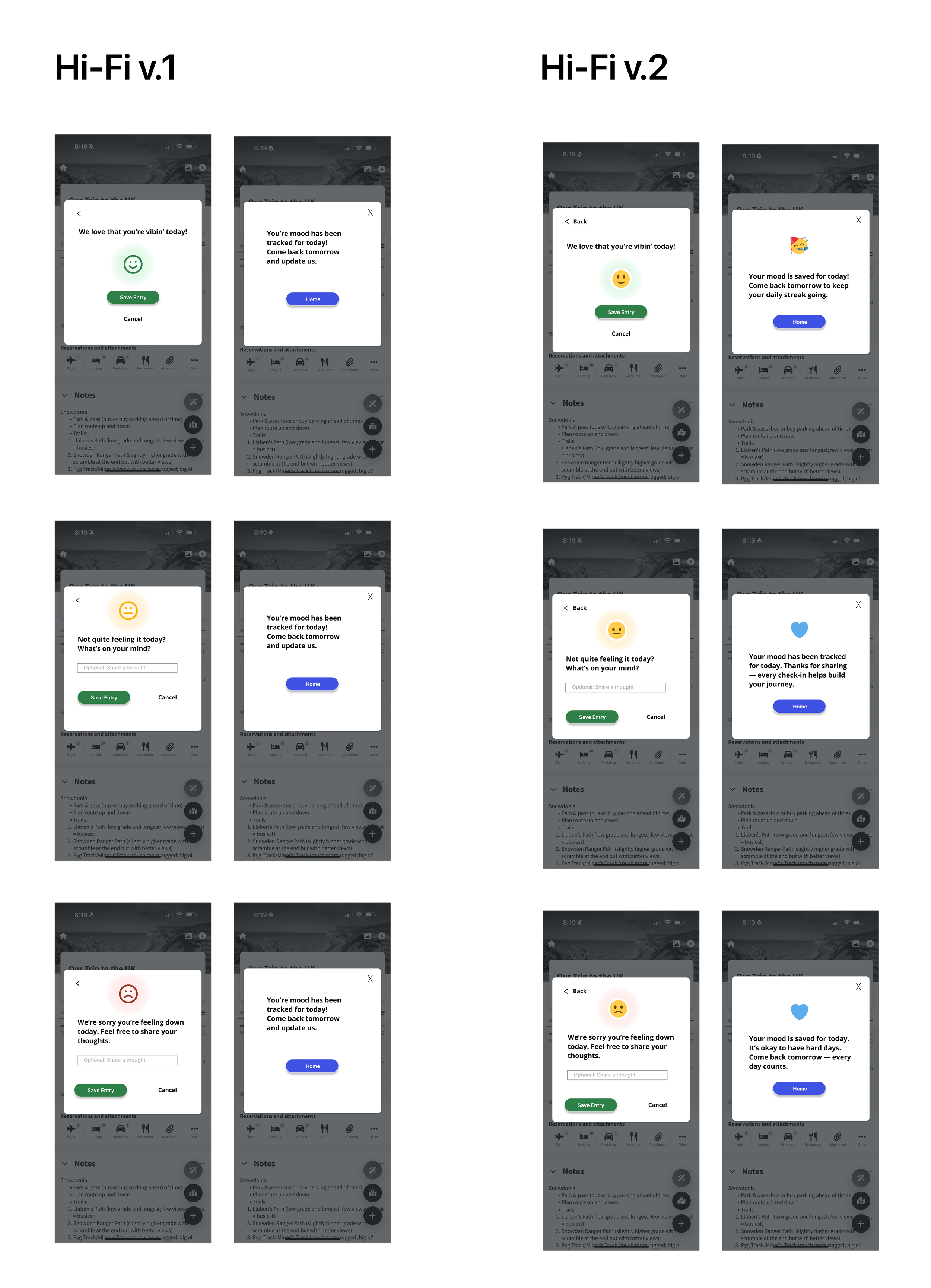
Hi-Fidelity v.2
The final round built directly on that feedback. I refined both flows to emphasize empathy, clarity, and orientation.
For the Mood Check-in, confirmation copy was rewritten to celebrate completion and subtly encourage repeat use, reinforcing the habit loop. The Overbooked Day Adjustment added a quick, plain-language recap directly in the itinerary, paired with an undo option to reduce second-guessing.
By this stage, participants completed both flows with confidence. Overbooked days became easier to rebalance, mood check-ins felt quick and approachable, and every action closed with a clear outcome. The result was a shift from pure logistics to a more human-centered Wanderlog experience—one that supports both the schedule and the traveler.
Main Changes Between Hi-Fi v1 & Hi-fi v2
Test the Prototypes
Final Thoughts
Wanderlog began with a clear gap: the app made planning easy, but once a day tipped into Overbooked there was little guidance to rebalance—and there was no simple way to reflect on how the day actually felt. Early tests surfaced predictable friction: users missed the mood check-in, confirmations felt clinical, Undo wasn’t obvious, and people wanted a plain recap of what changed.
Through interviews and two rounds of prototyping, those pain points became opportunities: keep actions inline with the itinerary, add a concise recap + near-action Undo, and use empathetic copy so check-ins feel supportive. Style-tile additions (Golden Sun, Cool Blue, Energetic Green, Tart Red), refreshed mood/alert icons, and a subtle highlight behind the tracker brought clarity without breaking Wanderlog’s brand.
Each iteration sharpened clarity and trust. Hi-Fi v1 increased CTA sizing and contrast; Hi-Fi v2 refined tone, added text labels to Back/Close, and cleaned alignment across cards. By the final test, participants completed both flows with confidence—overbooked days were easier to rebalance, and mood check-ins became a quick, repeatable habit. The experience shifted from pure logistics to a human-centered Wanderlog, where travelers feel guided, not managed.
