

Case Study: App Design
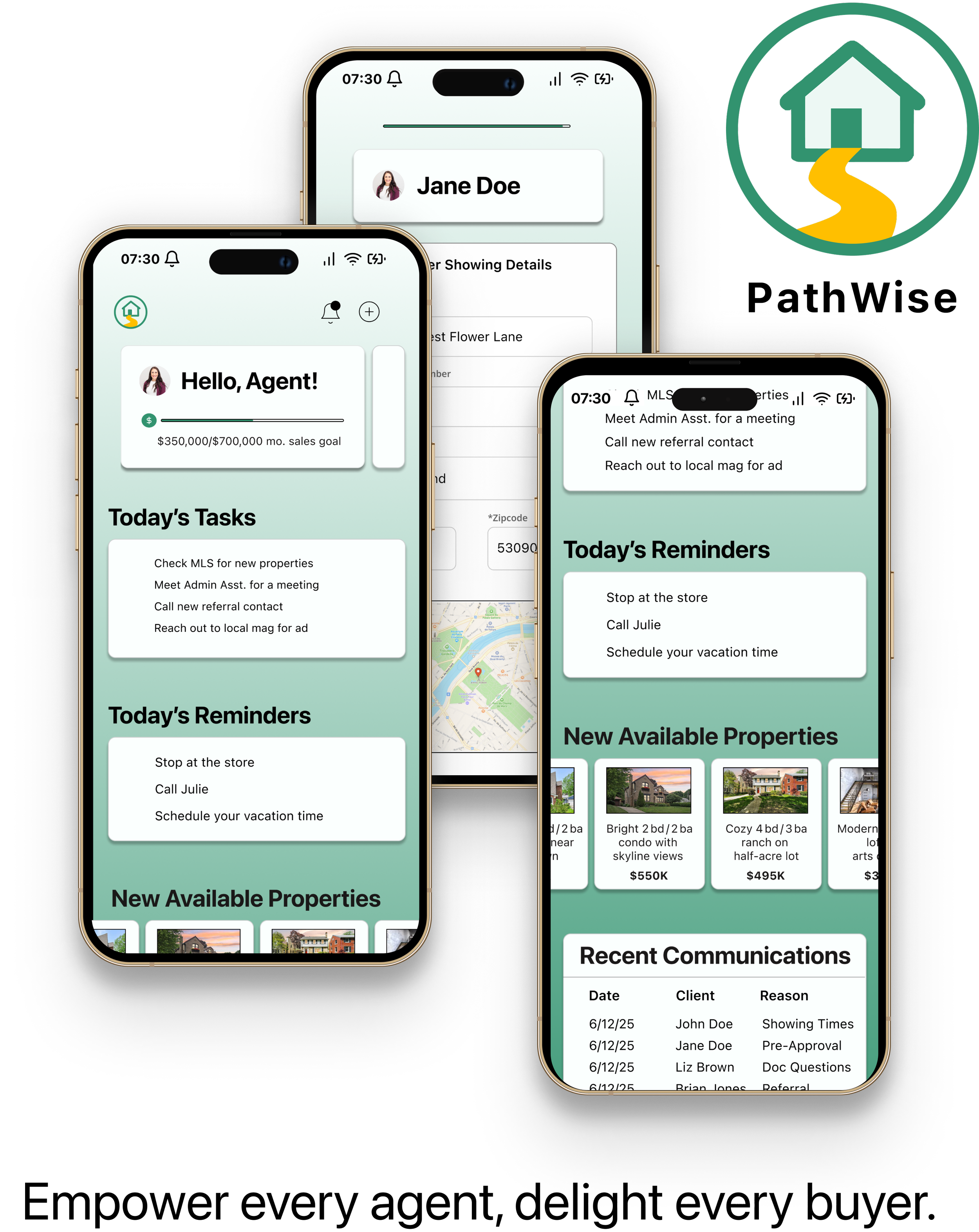
PathWise is a mobile workflow and communication app for real estate agents. It pulls texts, email, tasks, showings, and documents into a single iOS workspace so agents move faster with clarity.
Role
UX Researcher & Designer (Designlab Academy)
Platform
iOS
Tools
Figma, Adobe Creative Suite, Google Workspace
Year
2025 - 100 hours
The Spark & Founding Hypotheses
This project started with a candid chat with my own real estate agent about his day-to-day. In ten minutes he described three frictions that kept repeating:
Constant context-switching across texts, email, calendars, and checklists just to keep one buyer aligned.
Uncertain status—“Did they open it? Did they sign? What’s next?”—which fuels repeat follow-ups.
Time pressure to reply in minutes without sounding robotic.
Hypotheses: Assumptions to Test
Rather than let that conversation hard-code the direction, I translated those sparks into four falsifiable hypotheses and set up a quick discovery pass (agent survey + follow-up
interviews + affinity mapping) to validate or eliminate them before any detailed design.
Speed with structure — Centralizing updates, tasks, and docs clarifies “what’s next.”
Signal to watch: Faster task completion when status + next step appear together.Visibility reduces rework — Read/receipt signals cut “just checking” pings.
Signal to watch: Fewer redundant follow-ups; clearer agent/client behaviors.Human-tone automation — Messages that sound like the agent get used.
Signal to watch: Comfort with templates; where automation pauses for human touch.Lightweight adoption wins — One-minute onboarding increases solo-agent uptake.
Signal to watch: Minimum setup that still feels useful on day one.

Early research confirmed that the core frictions and hypotheses were aligned: agents wanted the speed of a text thread and the structure of a CRM; expectation gaps—not market forces—were driving most client stress; and automation only worked if it still felt personal. These insights gave me a direct line from one real conversation to focused research, ensuring that every design decision was rooted in agent pain points rather than assumptions.
Industry Overview and Investment
Despite 2023 being the slowest housing market since 1995, U.S. agents still closed 4.09 million existing-home sales (National Association of Realtors). PropTech investment continues to grow: KPMG / CB Insights reported a record $13.4B in funding, much of it aimed at “agent-enablement” platforms that simplify communication, scheduling, and document handling.
The challenge isn’t a lack of features—tools have become powerful but fragmented. Agents juggle texts, emails, CRMs, and PDFs, paying the cost in constant context-switching and status uncertainty.
How PathWise Was Born
After careful consideration, I ran a survey to validate my hypothesis. Questions explored how agents communicate, how quickly they’re expected to respond, and which tasks consume the most time.
When I surveyed 13 working agents and asked them what they use as their main source of communication, how fast they were expected to answer clients, and what (if anything) caused breakdowns in communication with buyers. Three insights stood out:
85% rely on texting or direct calls as their main update channel—yet those conversations live outside any CRM. This shows a major gap: the fastest and most natural form of communication for agents is disconnected from the tools meant to track deals.
8 in 13 said they must answer buyers “within minutes.” Speed is non-negotiable. CRMs aren’t built for this immediacy, leaving agents scrambling between platforms just to keep up with client demands.
The #1 root cause of breakdowns wasn’t price or paperwork; it was “misunderstood expectations”—often made worse by juggling too many tools. Agents admitted that even when deals didn’t fall apart, they were still patching together email threads, phone logs, and sticky notes to stay afloat.
Half of respondents went further, calling a real-time, shared platform “very” or “extremely important.”
These insights expanded on the original spark by showing just how widespread the frictions were. Agents reported spending too much time juggling between apps to manage one client, repeatedly following up because they couldn’t see if documents were opened or signed, and feeling pressure to respond instantly without tools that helped them do so. Survey responses confirmed that the real pain wasn’t just lost minutes — it was the mental load of staying organized and responsive across scattered channels.

Process: Double Diamond Framework
Discover → Define → Develop → Deliver
To frame the process, I used the Double Diamond model—moving from discovery to definition, and from development to delivery.
Discover: Survey + competitor analysis
Define: Pain points, goals, and personas
Develop: Wireframes + flows + prototypes
Deliver: Usability testing and revisions
Preliminary Research & Project Goals
“My phone isn’t the problem—my ten apps are.”
That line came from Claudia, a solo agent I surveyed. In a single morning she recaps toggling between Apple Notes, a CRM tab, two email threads, and three group texts—just to keep one buyer on track. By noon she’d lost the parking‐lot sticky note that held her next reminder.
Goals
PathWise aims to give agents a single, friction-free hub that:
Replaces scattered texts, spreadsheets, and legacy CRMs
Automates reminders and offer-timeline alerts without sounding robotic
Surfaces real-time client engagement (opens, read receipts, task status)
Cuts showing-scheduling time to under one minute.
My design goal is an elite app that agents can adopt in a single afternoon and that measurably reduces follow-up workload and missed expectations.
Survey & Interviews
To gain more insight into the daily life of a real estate agent and to see if any of my hypotheses would hold water, I conducted an agent survey . Their responses revealed clear patterns in how communication is handled today:
Heavy reliance on direct channels: 11 of 13 agents said they communicate with buyers primarily through text messages or phone calls, with “direct texting/calling” far outweighing CRM use. Only 1 respondent named a CRM as their primary tool.
Speed pressure is real: Just over half (7 of 13) said they need to respond immediately (within minutes), while most of the rest still aimed for responses within a few hours—showing that delayed replies are rarely acceptable.
Comfort with tech varies: While the majority described themselves as very comfortable adopting new platforms, a minority (3 of 13) admitted to being only somewhat comfortable or even somewhat uncomfortable. This suggests new tools must be intuitive and low-friction.
Breakdowns are infrequent but not absent: Most agents reported breakdowns as rare (<10% of the time), but a few experienced issues more regularly—ranging from occasionally (10–30%) to sometimes (30–50%). These breakdowns often tied back to fragmented communication across tools.
Together, these findings quantified the earlier spark: agents depend heavily on fast, informal channels, but the tradeoff is scattered records, uneven adoption of digital platforms, and occasional but costly miscommunication.

Why We Ran the Agent Survey — and What It Told Us
After an informal but revealing conversation with my real estate agent, it became clear that the daily experience of managing clients was far more fragmented and time-consuming than I’d realized. But one story isn't enough to design from—so I launched a survey to understand how widespread these challenges really were.
The goal was to validate (or challenge) the initial hypotheses by gathering a broader perspective from agents with different workflows, tech stacks, and support systems. I focused on uncovering how agents manage daily communication, task tracking, scheduling, and client onboarding.
Key results stood out:
87% said they rely on a mix of apps, text threads, and manual reminders to track progress.
72% admitted to sending duplicate messages or missing client tasks due to app switching.
And over 60% said they’d love a “centralized place” to track both client status and what needs to happen next.
These weren’t just isolated pain points—they represented repeated, daily inefficiencies that cost agents time and credibility. This helped define the “problem space” in the Discover phase of the Double Diamond. As I moved into Define, these insights guided the identification of core design opportunities: unify scattered actions, reduce friction in task assignment, and surface key status signals at a glance.
Competitor Analysis: Findings and Opportunities
To sharpen that definition, I conducted a competitor analysis—this time expanding beyond general patterns into full SWOTs for each major player. By breaking down individual Strengths, Weaknesses, Opportunities, and Threats for each competitor, I could highlight exactly where PathWise could differentiate.
When I compared Zenlist, Side, and reAlpha side by side, a clear pattern emerged: each excels in one dimension, but none cover the everyday workflow pains that agents described in my survey.
Zenlist is strong on MLS integration and agent–buyer collaboration. Agents and clients can share searches, chat, and see listings in real time. But Zenlist stops short of workflow depth—there’s no task automation, onboarding support, or integrated follow-up.
Side gives elite agents the ability to spin up their own branded firms with full backend support. For top producers, it’s a powerful all-in-one. But its focus on high-volume, luxury agents means solo or mid-level agents don’t get a lightweight option that fits their day-to-day needs.
reAlpha leans on AI for discovery, tour scheduling, and matching. That speed is appealing, but it comes at the cost of human-tone communication and client trust—something our survey respondents said was critical in high-stakes transactions.
Key Findings
Common Strengths (across existing real estate agent tools):
They all let agents share listings and schedule showings—monetizing both lead generation and premium placement fees.
Common Weaknesses
No end-to-end workflow templates – Most apps stop at lead capture; agents still build task lists and reminders in spreadsheets.
Fragmented communication tracking – Texts, emails, and in-app messages live in separate logs, so agents can’t see a single engagement history.
Manual showing logistics – Calendar booking tools rarely bundle door codes, driving directions, or auto-reminders; agents re-type them each time.
Zero read-receipt or document-view visibility – After sending disclosures or offers, agents have no confirmation the client opened them, leading to repeated follow-ups.
Opportunities for PathWise
Prioritize robust filtering and customized recommendations.
Unified Engagement Timeline
Aggregate every text, email, in-app message, document view, and showing into one chronological feed—something no mainstream agent tool offers.Workflow Templates
Pre-built (and custom made) templates for agents to help simplify the client onboarding process.Smart Showing Logistics
Auto-attach door codes, parking notes, and map links to each showing, plus one-tap calendar sync for both agent and client.Offer-Status Transparency
Visual tracker that shows “Sent → Viewed → Signed → Accepted,” eliminating “Did you get my offer?” calls and speeding decisions.Personalized, Human-Tone Automation
AI-assisted reminders that borrow the agent’s writing style, so follow-ups feel personal while saving time.Analytics & KPIs Out-of-the-Box
Surface metrics like average response time, unread document counts, and workflow bottlenecks—turning anecdotal follow-ups into data-driven improvements.
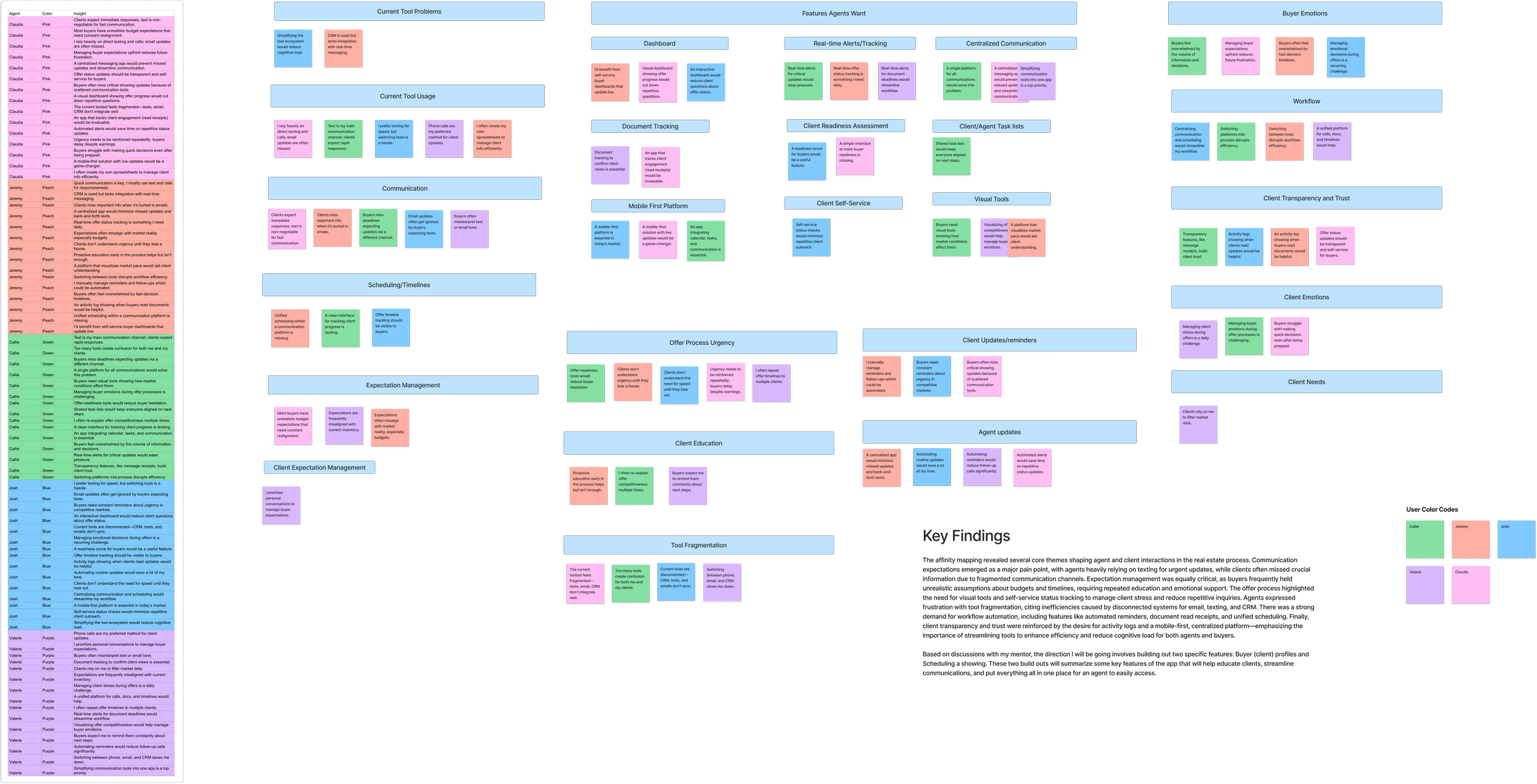
Affinity Mapping
To turn the survey and interview fragments into direction, I ran an affinity map. These affinity insights didn’t just label pain points—they dictated structure and behavior. They’re why the checklist collapses, why conflicts shout, why confirmations offer next steps, and why PathWise feels like speed with structure instead of just another place to type.
Tensions that shaped the IA
Speed vs. assurance: Agents must reply in minutes, but also need proof—“Did they open it? What’s next?” → drove the Communication Hub + Engagement Log (read receipts, doc-view status).
Automation vs. human tone: Strong appetite for auto-reminders if editable → informed pre-built templates that preserve the agent’s voice.
Centralization vs. flexibility: One place for messages, tasks, and showings, without “enterprise setup” → led to the Quick Action entry and lightweight onboarding.
Where breakdowns actually occur
Handoffs (e.g., “I texted the link, they replied by email”) → need a single client thread that ingests both.
Waiting periods (“Is the buyer pre-approved yet?” “Did they sign?”) → need status chips and auto nudges tied to due dates.
Time collisions (stacked showings, tight turnarounds) → need conflict banners, duration chips, and a calendar-first path.
The “north-star” rules we carried into every screen
Show “what just happened” and “what’s next.”
One thread per client; one place for truth.
Make the happy path one tap shorter; make errors unmissable but recoverable.
Progress is visible (bars, chips, toasts), not implied.
Persona
After clustering my research insights, I initially sketched two separate personas—but their needs and pain-points overlapped so heavily that a single, richer persona made more sense. The result is Joshua, a composite agent who embodies the dominant patterns we observed across interviews and survey data.
Joshua doesn’t lack leads; he lacks minutes in a day.
Bringing Joshua to Life:
“If it isn’t instant or intuitive, it doesn’t work for my clients — or me.”
Joshua is the agent you see pacing outside an inspection, AirPods in, thumbing quick texts between phone calls. At 41 he’s closed enough deals (11‑year track record) to trust his gut, yet still spends half an hour every evening stitching spreadsheets, emails, and screenshots into some semblance of a timeline.

Project Goals - PathWise at a glance
Business Objectives
Boost agent productivity: cut admin time 30 %, halve manual follow-ups, and drive daily use of scheduling/comm tools.
Reduce client drop-off & mis-communication: 40 % fewer missed updates and +25 % jump in post-close satisfaction.
Stand out in a crowded market: launch 3+ truly agent-specific features and score 90 % mobile-usability.
Drive long-term adoption: hit 60% retention at 90 days, WAU/MAU ≥ 0.6, NPS 50+.
User objectives
One hub for all messages, tasks, showings, docs.
Automation for reminders and timelines that still feels personal.
Clear read-receipts and offer-deadline visuals to manage buyer expectations.
Less tool-switching, more time selling.
Where business & User Goals Overlap
Simplify the tech stack → fewer apps, lower support cost.
Full timeline transparency → happier clients, fewer agent “status?” calls.
Real-time, mobile-first experience → faster decisions, faster deal flow.

POV and HMW Insights - Defining PathWise’s Focus

After affinity mapping, three main things surfaced and became our Points of View (POVs). Each POV then sparked a set of “How Might We” (HMW) questions that now guide every design decision.
POVs (Points of View):
POV 1 · Communication & Workflow Overload
Joshua, a fast-moving solo agent, is buried in texts, emails, and sticky-note reminders. He needs one place to manage follow-ups without losing his personal touch.POV 2 · Visibility & Client Accountability
Joshua tracks engagement manually and guesses when to follow up. He needs real-time clarity on what clients have viewed—or ignored.POV 3 · Fast Decision-Making in a Competitive Market
Joshua works in bidding-war territory; buyers hesitate and miss out. He needs visual tools that convey urgency and market pace.

HMWs (How Might We) from POV 1:
HMW automate reminders while still sounding human
HMW cut the time spent sending the same update across channels?
HMW merge every message into a single, mobile-friendly feed?
HMWs from POV 2:
HMW show live “opened / viewed” status for docs and messages?
HMW create a running engagement log that kills the guess-work?
HMW rank follow-ups by client activity so his time goes to the hottest leads?
HMWs from POV 3:
HMW visualize offer timelines so clients decide faster
HMW end repeat “hurry-up” calls with dynamic, client-facing updates?
HMW frame market data so buyers feel confident acting quickly?
Sitemap
The PathWise sitemap was crafted to reflect a streamlined, action-first experience for real estate agents. While I didn’t conduct a formal card sort, the structure was heavily informed by findings from both the agent survey and interviews. Agents emphasized the need for quick access to active clients, showing logistics, and task management—all of which directly shaped the core navigation.
Rather than organizing the app around content categories, I grouped screens by functional goals: what the agent is trying to do. This led to a dashboard-driven structure with dedicated paths for client management, task tracking, and communication tools. The Quick Action menu supplements this with one-tap access to high-priority actions like scheduling a showing or adding a new client.
By aligning the information architecture with the mental models of time-strapped solo agents, this sitemap serves as a foundation for focused workflows and fewer distractions.

Task Flows
Before diving into design, I mapped out two core task flows to define what an ideal experience could look like for busy solo agents. These flows were directly informed by research insights—specifically survey results indicating time pressure and confusion around client task progress, and interviews that revealed the pain of context switching between communication, scheduling, and admin tools.

Flow: Dashboard → Add Client → Short form (required fields) → Assign template → Client Profile
Key decisions:
One short form; required-field indicators (v2)
Immediate workflow assignment prompt
Land on Client Profile (v2) for continuity and next steps
Add a New Client + Assign Workflow

Schedule a Showing
Flow: Dashboard/Client → Schedule Showing → Date/Time → Details → Confirm → Client Profile
Key decisions:
Elevated entry in Quick Actions (v2)
Pre-fill context when starting from a client (v2)
Confirmation screen with share/schedule-another/return options (v2)
Wireframes
With the task flows finalized, I started with quick sketches—low-stakes, fast explorations that let me map interactions onto the structure before committing to wireframes. Sketching also helped me visualize different layout options and helped shape the mobile confines of designing.
Each sketch had a focus:
Client onboarding: Make “Add a New Client” feel simple enough to complete in under a minute.
Workflow assignment: Show both current status and next step in one view to reduce tool-hopping.
Scheduling: Keep “Schedule a Showing” as a short, predictable flow.
Automation tone: Explore where templated nudges could sound human instead of robotic.
These sketches gave me a foundation to test ideas quickly and establish the overall workflow PathWise needed to support.
Add a Client + Establish Workflow: Lo-Fi Sketches
Lo-Fidelity Sketches


Login / Recognition
The very first sketch explored the entry point: how an agent starts their day in PathWise. I tested both a simple text login and a “face ID recognition” shortcut, since speed and ease of entry are critical for busy agents who check updates dozens of times a day.Agent Dashboard
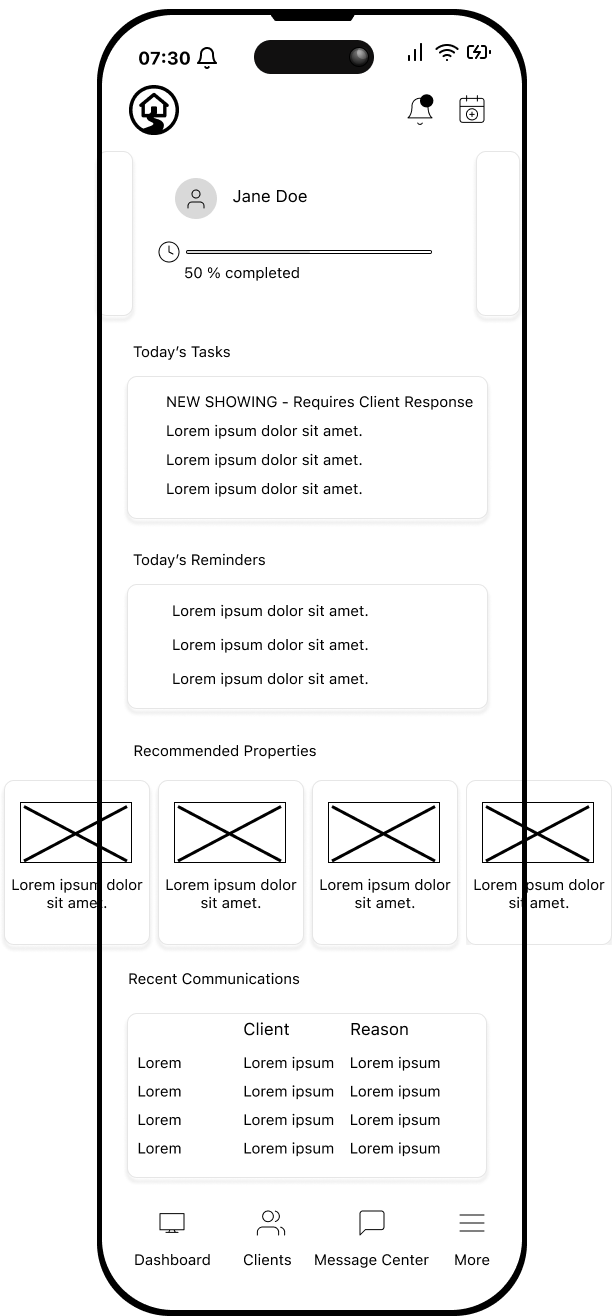
The dashboard sketch was about orientation. What does an agent see first? I prioritized a clear list of current clients and workflows in progress, so the screen immediately answers “who needs my attention right now?”Client Detail View
Here, I mapped out what happens when an agent selects a client. This screen surfaces status updates and next steps together—directly addressing the friction of tool-hopping just to know “where things stand.”Workflow Assignment
Once inside a client profile, agents need to assign or adjust workflows. The sketch tested how to present pre-set templates alongside editable fields, balancing structure with flexibility.Scheduling a Showing
This screen tackled one of the highest-frequency jobs: scheduling a showing. The goal was to reduce taps, keep availability clear, and confirm in one place so agents didn’t have to bounce between calendar and messaging apps.Confirmation / Next Action
Finally, I sketched how a confirmation should look: not just “success,” but also the logical next action. This prevents dead ends and keeps the agent moving smoothly through their day.
Schedule a Showing - Lo- Fi Sketches
Lo-Fidelity Sketches

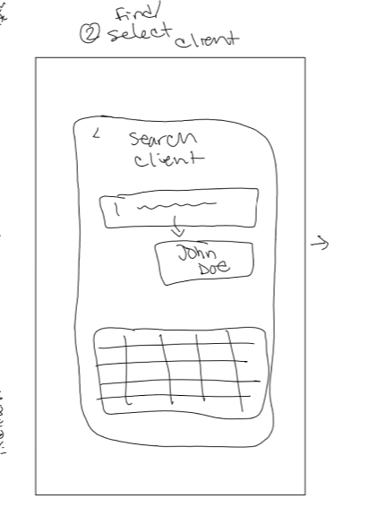


This second flow focused on one of the most critical daily jobs for agents: scheduling and managing showings. By sketching it out first, I could test the logic and sequence of steps before committing to wireframes. Each screen was drawn to explore how PathWise could make showings quick to set, easy to confirm, and fully visible within the workflow.
Select Client
The flow begins with choosing which client the showing is for. This ensured the schedule would always be tied back to a specific client record, avoiding the common problem of fragmented notes or reminders.Property Selection
Agents then select which property to show. I sketched a layout that makes property details clear while still allowing fast selection, since showings are often scheduled under time pressure.Pick Time / Date
A calendar view provided the chance to sketch out how availability might be displayed. This was key to reducing back-and-forth between client and agent — everything visible in one place.Create Event Detail
Once a property and time are chosen, this screen mapped how agents add key details (location, notes, and reminders). The sketch tested how much could be pre-filled vs. customized without slowing down the flow.Send Confirmation
To reduce uncertainty, I included a confirmation screen showing what the client would receive. This reinforced the hypothesis that visibility (knowing “what’s next”) reduces rework and redundant follow-ups.Agent Dashboard Update
Finally, I sketched how the showing appears back on the agent’s dashboard. This was critical to closing the loop: making sure scheduled events automatically update the workflow so agents don’t need to re-enter or track them elsewhere.
Add a Client + Establish Workflow and Schedule a Showing - Mid-Fi Iterations: v.1
Mid-Fidelity - Add a Client & Establish Workflow


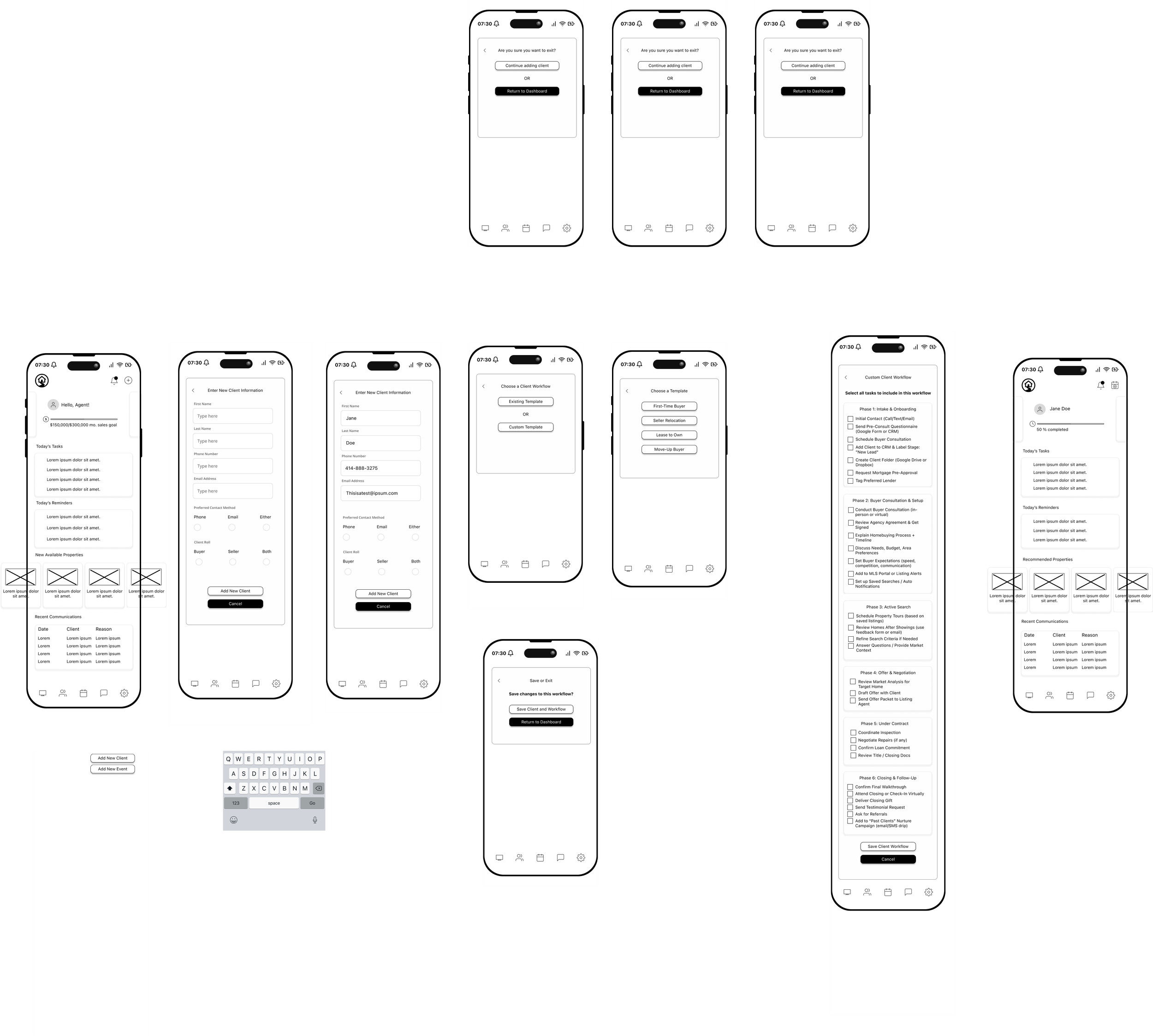
After sketching the onboarding flow, I translated it into mid-fidelity wireframes to validate whether agents could easily add a new client and assign them a workflow. This was one of the most common daily jobs surfaced in research, so it became the first flow to test.
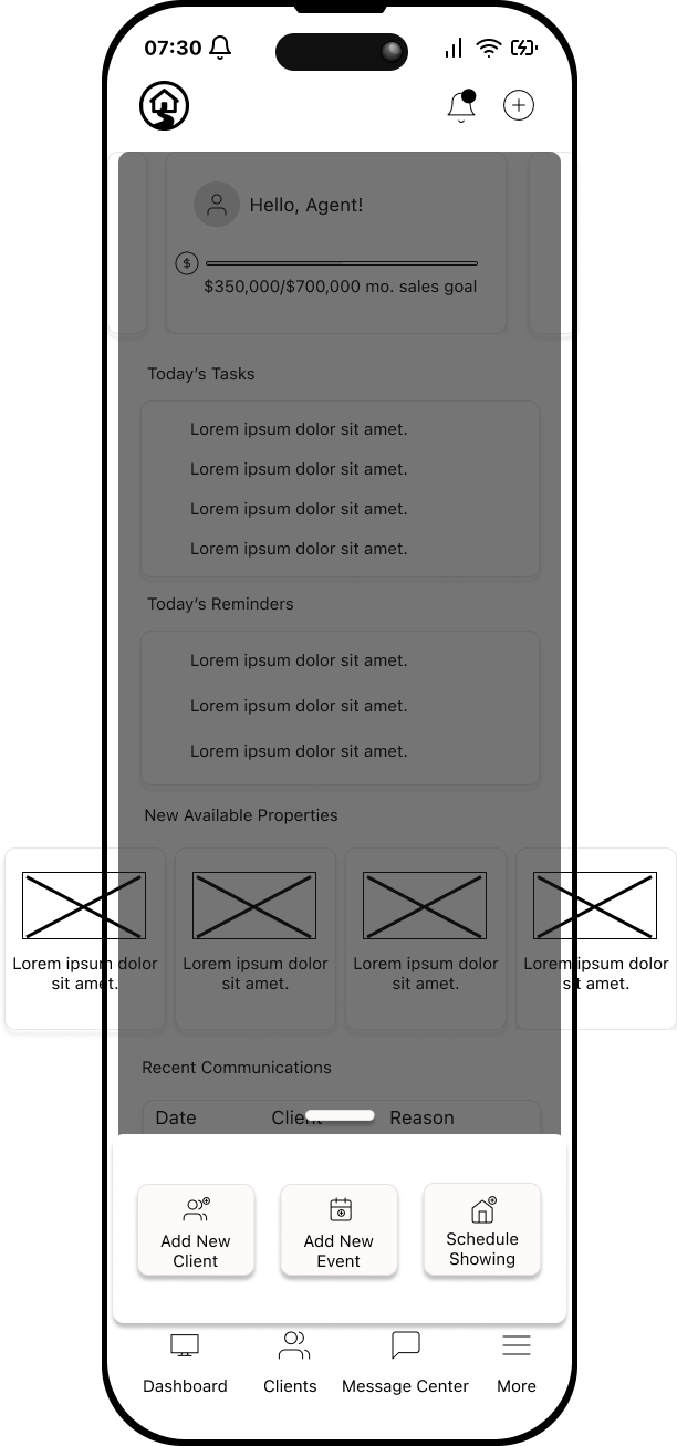
Dashboard (Starting Point)
The flow begins at the agent dashboard. This screen was designed to quickly orient the user with active clients and make “Add New Client” a top-level action, reducing the need to dig through menus.Add Client Form
The next screens explored how much information should be required upfront. I tested a simple form with fields for client basics (name, contact info, preferences). The intent was to see whether agents found this lightweight enough for quick entry, or too heavy to repeat multiple times a day.Assign Workflow Template
Once a client is created, the flow shifts to assigning a workflow. Here, I tested showing pre-set templates (e.g., “Buyer Workflow,” “First-Time Homebuyer,” “Investor”) so agents could save time, while still keeping the option to customize.Confirmation & Client Dashboard Viewing
Finally, I tested how confirmation would look. Instead of just “success,” the flow closes by showing the client profile the agent created, giving insight to what the client sees in their profile.
Testing the Wireframes
We tested with 5 people and wanted to see how quickly they could create a new client and establish their workflow, determine if the workflow felt helpful, and did thiis simplify agent processes.
Could agents add a client in under a minute?
Did the workflow assignment feel helpful, or like an extra burden?
Was the status/next step view clear enough to reduce redundant follow-ups?
The results from testing v1 informed the adjustments in Mid-Fi v2, where hierarchy and visibility were refined based on direct agent feedback.
The second core flow translated into mid-fidelity wireframes was Scheduling a Showing. Research showed this was one of the most time-sensitive, repeatable actions for agents—and a common pain point when details were scattered across texts, emails, and calendars. Mid-Fi v1 tested whether scheduling could be streamlined into a predictable, repeatable sequence.
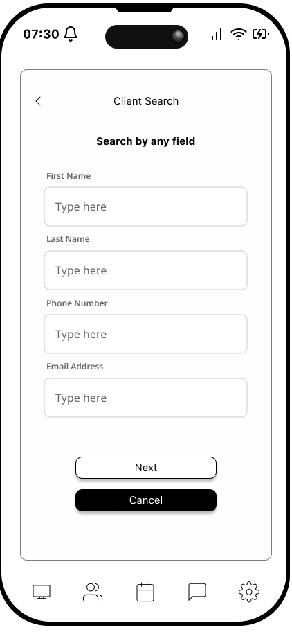
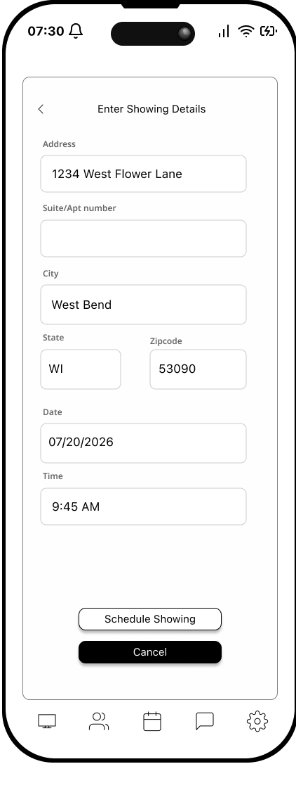
Flow: Agent Dashboard → Client Search → Showing Details → Client Profile
Agent Dashboard
The flow began from the main dashboard, where agents could initiate scheduling. However, testers noted that the entry point wasn’t as visible as it needed to be for such a high-frequency task.Client Search
Agents first selected which client the showing was for. This step tied every appointment back to a client record, but added extra taps compared to expectations of a “one-tap” shortcut.Showing Details
The details screen captured the date, time, property, and notes for the showing. While functional, form fields weren’t fully optimized for quick entry, leading to minor friction.Client Profile (with toast confirmation)
Once saved, the flow returned to the client’s profile with a small toast confirmation. This provided feedback that the showing had been scheduled but didn’t always feel substantial enough to reassure agents.
Impact of Mi-Fi v1 Wireframes:
Agents could complete the task, but usability testing surfaced three issues:
The entry point was harder to find than expected.
Form fields felt serviceable but not streamlined for speed.
Confirmation feedback lacked visibility and left some testers unsure the action had succeeded.
Mid‑Fi v1 – First Clickable Draft : Key Updates
• Floating “+” Quick‑Action offered only Add Client, New Task / Reminder, and Upcoming Deadlines.
• No inline field validation or duplicate‑client check.
• Workflow checklist displayed as a single 40‑item scroll.
• No conflict alerts or confirmation screens.
Impact: Early testing surfaced three pain‑points: checklist fatigue, desire for conflict warnings, and hesitation with icon‑only navigation.
Mid-Fidelity - Schedule a Showing


Add a Client + Establish Workflow and Schedule a Showing - Mid-Fi Iterations: v.2
After v1 testing, agents could complete the flow but struggled with finding core tasks quickly and distinguishing primary actions. v2 focused on clearer navigation, task-first entry points, and more scannable buttons.
Tasks-First Menu Redesign
I reworked the global menu to foreground core jobs (e.g., Add Client, Schedule a Showing). Primary actions moved into a dedicated, easy-to-reach entry (“Quick Actions”), and button styles were refined (consistent primary vs. secondary, full-width CTAs, larger hit targets). The goal: make the next action obvious the moment an agent lands in the app.Add Client Form (Refined Layout)
Fields were reordered and grouped for faster scan and completion. Mobile-specific inputs (numeric keypad, email keyboard) reduced friction and errors.Streamlined Data Entry
Larger tap areas, clearer labels, and progressive disclosure kept the form lightweight while still capturing essentials.Workflow Overview (Status + Next Step)
The current step and the next action were surfaced side by side to reduce tool-hopping and “what’s next?” uncertainty.Save Workflow → Client Profile Page
Instead of dropping agents back at the dashboard, v2 directed them straight to the client’s profile page after saving. This reinforced continuity, gave immediate visibility into the assigned workflow, and kept the agent focused on that client rather than forcing another navigation step.
Mid-Fi v2 directly addressed the pain points uncovered in v1. The menu redesign made critical tasks immediately visible, reducing hesitation. Refined button hierarchy and more deliberate CTAs improved clarity, preventing missed taps. The reorganized form allowed agents to add clients more quickly without feeling weighed down, while mobile-specific input types reduced errors. The workflow overview provided instant visibility into status and next steps, and the redirect to the client profile page gave agents immediate confidence that their action was successful while keeping them in the right context.
Task #2: Mid-Fidelity v.2


Mid‑Fi v2 – Post‑Test Iteration- Key Updates
• Quick‑Action menu expanded to include Schedule Showing and Add Event, presented in a cleaner inline layout.
• Forms gained required‑field asterisks and a “No Duplicate Client Detected” toast.
• Checklist broken into collapsible sections.
• Added map preview in showing form.
Impact: These changes cut average task time by ~25 %, eliminated checklist overwhelm, and gave users clear end‑state feedback.
Main changes between Mid-fi v.1 and Mid-fi v.2


Task #1: Mid-Fidelity v.2
At the heart of PathWise are four guiding principles. Clarity First ensures every screen, status, and reminder eliminates guess‑work, so agents and their clients always know exactly where they stand. Human Speed means the app delivers updates as fast as a text message while preserving the agent’s personal tone—automation without the robotic feel. Our commitment to a Trusted Partnership keeps PathWise neutral and ad‑free, elevating professionalism and strengthening client confidence. Finally, Agent Empowerment drives every feature: routine chores become one‑tap actions, letting agents spend less time juggling tools and more time advising their buyers and sellers.
Brand Values and The Why

Mood Board
Color Palette: PathWise’s palette balances confidence with calm. Electric Purple drives the action—it’s bold enough to energize calls‑to‑action while still reading professional on mobile. A flash of Golden Sun would highlight critical moments (deadlines, alerts) with upbeat warmth rather than alarming red. All of it rests on Off‑White card panels and easy to read typography, giving the UI a crisp, editorial finish that feels both modern and trustworthy.
Typography
We chose SF Pro for its wide language support, tall x‑height, and familiarity to iOS natives. A 1.25 × modular scale keeps hierarchy clear: 32 px / 20 px / 18 px for headers down to a comfortable 15 px caption—large enough for thumb‑reach scrolling yet compact on dense dashboards.
Logo exploration
I designed two different logos: a handshake monogram and the house‑with‑path lockup. Ultimately, I decided on the second one because it sits neutrally with any brokerage branding—aligning with the Trusted Partnership value.
Result
The palette, type, and icon set together create a UI that feels steady, modern, and instantly legible—delivering on PathWise’s core values of Clarity First, Human Speed, Trusted Partnership, and Agent Empowerment.

PathWise Style Tile
Hi-Fi Wireframes
Add a Client + Establish Workflow - Hi-Fi Iteration

Following the mid-fi refinements, I brought the flows into high-fidelity to test whether agents could not only complete the task quickly but also feel confident that workflows were attached correctly from the start. A total of five people were tested for the same tasks.
Hi-Fi Usability Testing – Key Stats
Participants: 5 real estate agents
Tasks Tested:
Save client work (and return to profile)
Schedule a showing (with event details)
Task Completion: 100% across all participants
Average Time on Task:
Save client work → ~35 seconds
Schedule a showing → ~1 minute 15 seconds
Error Rate: 0 critical errors, only 2 minor hesitations (both related to wording in event notes)
Intuitiveness Score: 8.7 / 10 average rating
Confidence Boost: 4 out of 5 participants explicitly said the flow felt faster than their current mix of tools; 3 mentioned reduced risk of mix-ups with client-linked showings
Schedule a Showing - Hi-Fi Iterations

Test the Prototypes
Final Thoughts
PathWise began with a simple hypothesis: solo real estate agents lose precious deal time to scattered tools and unclear client communication. Grounded in surveys, interviews, and three rounds of prototype testing, the project turned that insight into a focused product—a mobile workspace that automates reminders, visualizes next steps, and schedules showings in seconds. Each iteration sharpened both clarity and speed: collapsing 40‑item checklists into staged tasks, adding duplicate‑client protection, and surfacing calendar‑sync and share shortcuts. By the final hi‑fidelity test, every participant completed the two core flows with 100 % success and rated overall intuitiveness 8.5 / 10.

PathWise now delivers on its four brand values—Clarity, Human Speed, Trusted Partnership, and Agent Empowerment—turning daily chores into one‑tap actions and freeing agents to do what software can’t: advise, negotiate, and build client trust. The next phase will translate these validated designs into code, integrate MLS data for real‑time listings, and support team collaboration. With a research‑driven foundation and clear market need, PathWise is ready to become the go‑to workflow companion for modern real estate agents.