Case Study: End-to-End Design
VibeSync is a user-friendly, community-focused platform that makes it easy to discover, share, and attend local events in Southeast Wisconsin—whether you’re a visitor or a native, with or without social media.
Role
UX Researcher & Designer
Platform
Mobile
Tools
Figma, Adobe Creative Suite, Google Workspace
Year
2025
Overview
This project was born from a desire to solve a real-world problem: how to help people easily discover and attend events without relying on social media or scattered online searches.
I identified a gap in how users, especially non-social media users, discover and attend local events. VibeSync was conceptualized as a mobile-first solution focused on creating an easy, enjoyable, and trustworthy experience to search for, discover, and attend events.
Industry Overview and Investment
The event management software market is booming, valued at $7.1 billion globally in 2023, and projected to grow to $14.1 billion by 2029. This includes platforms like Eventbrite, Meetup, and even social-driven event listings on Facebook and Instagram.
Locally, events play a critical role in community engagement and economic development. They foster social connections, promote small businesses, and bring tourism dollars into neighborhoods. A streamlined, accessible way to find and attend these events can amplify their positive impact on local economies.
The Problem
"It began with two simple questions: How do people currently find events, and how can we make it easier for them?" I chose this topic because I personally struggled to find local events that matched my interests. I love simplifying systems, and I wanted to challenge myself to design a more intuitive way to connect people with experiences.
How do people find local events—and how can we make it easier, especially without relying on social media?
Process: Double Diamond Framework
Discover → Define → Develop → Deliver
To frame the process, I used the Double Diamond model—moving from discovery to definition, and from development to delivery. While full delivery wasn’t complete at the time, we successfully worked through the first three phases.
Discover: User interviews + competitor analysis
Define: Pain points, goals, and personas
Develop: Wireframes + flows + prototypes
Deliver: Usability testing and revisions
Research
Goals
My goals were to identify user pain points, understand how users currently find events, and explore their comfort levels with both in-person and virtual experiences. This would help shape a product that meets real needs, not just assumptions.
Identify top pain points and needs
Understand event discovery behavior
Learn how users want to attend events
(virtual vs in-person)
Interviews
I interviewed seven users between the ages of 30 and 55. Most relied on social media, Google, or word of mouth to find events. But they all voiced similar frustrations: too much time searching, not enough event info, and uncertainty around ticketing.
7 interviews, age 30–55, Milwaukee/Chicago based
Pain Points:
Events hard to find without social media
Need more filters (family-friendly, solo, parking)
Ticketing issues (security & trust)
Secondary Research
I conducted a competitor analysis of platforms like Eventbrite, Meetup, Facebook, and Google. While they all help users find events, many fall short in key areas—like filtering, detail accuracy, and payment security. These gaps presented opportunities for VibeSync.
Competitors: Eventbrite, Meetup,
Facebook, Google
Gaps: Lack of filters, limited event info,
too much sponsored content
Competitor Analysis: Findings and Opportunities
I conducted a competitor analysis of Eventbrite, Meetup, Facebook/Instagram, and Google Events.
Key Findings
Common Strengths: They all allow users to find and book events, with revenue streams from both attendees and event organizers.
Common Weaknesses:
Limited filtering options: Users struggle to narrow down search results based on personal preferences (family-friendly, cost, accessibility).
Overreliance on paid visibility: Boosted posts overshadow organic events, limiting discovery.
Lack of transparent ticketing guarantees: Users are wary of scams and unclear refund policies.
Scattered event logistics: Details like parking, arrival instructions, or whether it’s family-friendly are often missing.
Opportunities for VibeSync
Prioritize robust filtering and customized recommendations.
Ensure transparent, secure ticketing with consumer guarantees.
Provide logistical clarity for each event.
Design for users outside the social media loop.
Affinity Mapping
To synthesize the data, I used affinity mapping. Common themes emerged—especially the need for simplicity, clarity, and personalization in how events are discovered and booked.
Please click or tap image to see full affinity map
The affinity map synthesized interview insights into actionable themes. This wasn’t just an exercise—it highlighted recurring frustrations around search filters, event details, and ticketing trust. These directly informed the product’s core features.
Personas
The personas—Erica and Charles—emerged as a synthesis of research patterns, not singular interviewees.
Erica (31): Wants low-stress, family and solo-friendly event options.
Charles (40): Social media isn't helpful for finding tailored events. Wants quick, reliable experiences.
Why two personas? Their shared frustrations validated core problems, while their differing social habits ensured the platform serves both active and passive social users. Their needs backed up the POVs that guided product development. By moving methodically from affinity mapping ➔ POVs ➔ HMWs ➔ personas, I ensured that every design decision was user-centered and evidence-backed.
POV and HMW Insights
Once I had gathered primary research through user interviews and synthesized insights with an affinity map, I moved into the Define phase of the Double Diamond model. This is where Point of View (POV) statements and How Might We (HMW) questions became essential.
The pain points from my affinity mapping led to my POV statements. For example, I wanted to help users who aren’t on social media find events, and those who feel overwhelmed by the planning process. I ultimately moved forward with these three POVs, each grounded in real user voices.
Top POVs (Points of View):
Save users time finding events
Help non-social media users discover what's out there
Make it easy to book, share, and filter
My ‘How Might We’ questions followed naturally: How might we help users save time? How might we provide alternatives to social media? How might we match users to the right events easily? These HMWs served as problem-solving prompts, ensuring that my design decisions aligned with actual user frustrations rather than assumptions.
Key HMWs (How Might We):
Help users find events without social media
Let them filter by interest
Allow optional connections with or without social media
Task Flows
Please click or tap task flow pictures to see a larger depiction.
Create an Account
Homepage → Email & Password → Quiz → My Account
Book an Event
Search → Log in → Book Now → Payment Info → Confirmation Page
I mapped out two critical user flows: creating an account and booking an event. These flows would later shape the core structure of the prototype. Why these flows?
Account creation ensures users can save preferences, enabling personalized event recommendations.
Booking an event is the platform’s primary action—this flow had to be frictionless, clear, and secure.
These tasks reflect the most essential user goals uncovered in research and are pivotal to VibeSync's success.
Wireframes: Decision-Making Process and Rationale
With user flows in hand, I moved into wireframing. Early sketches focused on the quiz for personalizing event results and the simplicity of the booking interface. These evolved into mid-fidelity versions for better testing. From mid-fi, I created high-fidelity wireframes for both flows. This brought the user experience to life and prepared me for usability testing. Each level of wireframing—low, mid, and high-fidelity—allowed rapid iteration while constantly testing assumptions. Early lo-fi sketches focused on user flows, while mid-fi mockups refined navigation logic. Hi-fi prototypes added visual branding and prepared for realistic testing scenarios.
Create an account
Account creation with onboarding quiz
Designed in Figma and refined through usability testing
Please click or tap any of the images to see more.
In this low-fidelity phase, I focused on the skeleton of what a page might look like. I included essential elements such as navigation, footer, progress bars, and general layout so that I could apply these concepts in my mid fidelity design. These designs were inspired by user interviews and other product websites from my competitive analysis.
In the mid-fidelity phase, the focus was on establishing the foundational layout and functionality of the VibeSync interface. This included defining the placement of key elements such as navigation menus, content sections, and interactive components using grayscale tones and placeholder text. The design prioritized user flow and structural hierarchy without delving into detailed aesthetics, ensuring a clear understanding of the user journey and interface structure. No mid-fidelity testing was done as it was not asked for in the scope of this project.
Advancing to the high-fidelity stage, the design incorporated detailed visual elements to closely resemble the final product. This involved introducing the official color palette, typography choices, and actual imagery to enhance visual appeal and brand consistency. Interactive components were refined with precise styling, and spacing was meticulously adjusted to ensure a polished and intuitive user experience. These enhancements aimed to provide a comprehensive representation of the final interface, facilitating more accurate usability testing.
Book an Event
Search + book with transparency and ease
Designed in Figma and refined through usability testing
Please click or tap any of the images to see more.
In the low-fidelity stage, the "Book an Event" feature was initially conceptualized using hand-drawn sketches and basic digital layouts. The goal was to define the key user journey—discovering an event and initiating a booking. These early wireframes prioritized speed and ideation over detail, allowing for rapid iteration and feedback. Interactions were not yet defined, and placeholder boxes were used to suggest structure rather than function.
In the mid-fidelity phase, the "Book an Event" section focused on establishing the core structure and functionality. This included outlining the primary user flow for event booking, such as selecting an event, viewing details, and initiating the booking process. Design elements were presented in grayscale with placeholder text and basic shapes to represent interactive components, ensuring clarity in layout without the distraction of visual design elements. The emphasis was on user experience and ensuring that the booking process was intuitive and straightforward. No mid-fi testing was done as it was not within the scope of the project.
Transitioning to the high-fidelity phase, the "Book an Event" section was enhanced with detailed visual elements to mirror the final product closely. This involved incorporating the official color palette, typography, and actual imagery to align with VibeSync's branding. Interactive components, such as information input and confirmation buttons, were styled to reflect their final appearance and behavior.
The final Hi-fi wireframes (Hi-fi v.2) were made after feedback from the prototype testing. A screen outlining event details and one with more information regarding payment on the booking page were added to create a better and more transparent user flow. These progressive refinements from mid- to high-fidelity wireframes were crucial in aligning the design more closely with VibeSync's brand identity and user expectations, ensuring a seamless transition from concept to final product.
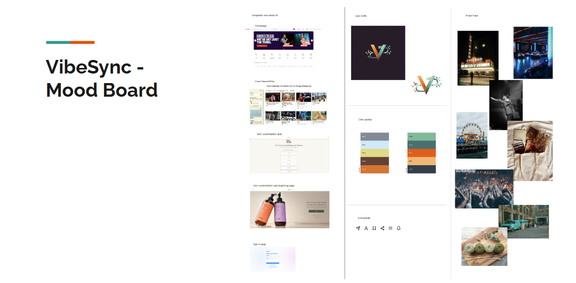
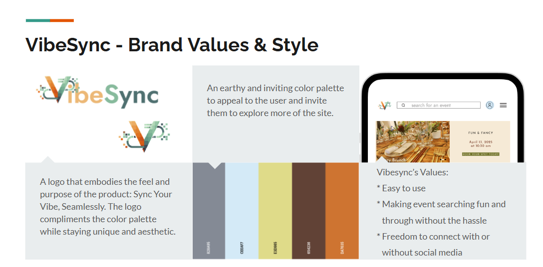
I also developed a brand identity for VibeSync—earthy, inviting, and easy to use. The platform isn’t just functional; it’s designed to be a pleasant space for discovery without the noise of social media. VibeSync’s brand was intentionally created to feel friendly, earthy, and inviting. This reflects its community-centered mission. Decisions about the color palette, logo, and voice were made to break from sterile event-finding platforms and create emotional connection.
Brand Values and The Why
Designed in Figma and refined with the assistance of AI tools
Please click or tap any of the images to see more.
Mood Board
Brand Values
VibeSync Style Tile
Prototype Testing
Five users tested VibeSync. The feedback was encouraging—users praised the clean layout and ease of use. Most importantly, it confirmed we were solving the right problems. One adjustment followed - adding a dedicated event info page and clarifying the payment process in the ‘booking an event’ task.
Users: 5 testers walked through account creation and booking tasks
Findings:
✔ Intuitive navigation
✔ Clear event discovery
➕ Added event info page after login
➕ Cost clarity added to payment screen

Test the Prototypes
Final Thoughts
In conclusion, VibeSync is set to deliver on its mission: to make discovering and attending events simpler and more inclusive. While there’s more work ahead—like refining quiz logic and expanding user inclusivity—this project sets a solid foundation for development. VibeSync successfully validates its hypothesis: a social-media-optional, user-friendly platform can simplify event discovery. However, continuous iteration on booking clarity and expanding accessibility for different user demographics will be crucial in the next phases.


